It’s a problem not discussed much outside of bank operations offices, but when the United States switched to an electronic check-clearing system about 10 years ago, capturing a high-quality image of the check suddenly became really, really important. Sending images across the country was a lot more efficient than exchanging the actual paper checks – but if someone deposited a check (or money order) that didn’t scan well, it opened up the way for all sorts of other issues, from incorrect account numbers and dollar amounts, to payments that would flat-out be rejected.
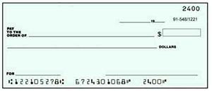
 What do the Patriots have to do with this? Well, when banks first started scanning checks, they figured out pretty quickly that it was NOT a good idea to have a lot of heavy printing or vivid backgrounds on them. Check images in the U.S. are required to be bi-tonal – that is, no color or shades of gray; pure black and pure white only, resulting in pixels that are “on” or “off” like binary code. So anything much darker or lighter than the rest of the document can play havoc with the contrast, resulting in an image that’s unreadable. That’s why most checks that you can order through your bank today are rather plain with muted colors, like the example at right.
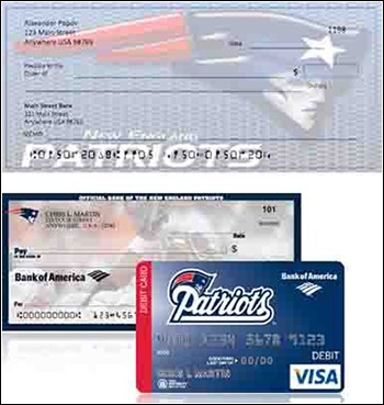
But as everyone knows, you don’t have to order checks directly from your bank – and a lot of the online suppliers will print just about anything on a check. (Some of them don’t even use enough magnetic ink on the MICR line at the bottom, but that’s a story for a different article.) Since they’re not the ones who have to scan them or exchange them like banks do, keeping the face free of interference is not quite as high of a priority for these dealers.
 As for the banker in our story – who we assume lives somewhere in New England – every day, he would encounter several of the same custom-printed checks with a Patriots logo on the front, which was too dark and fooled the scanner into adjusting the light levels, rendering the rest of the check unreadable. Each time one of them came up, the scanning queue would come to a halt for a “can’t-read” error, and the Patriots check would have to be pulled out and scanned again separately until a useable image came out – or if it simply wouldn’t scan correctly, it would be physically mailed off for clearing. (We have no idea whether either of the examples here are the specific checks that caused the problem, but hopefully you get the idea.)
Fortunately, things have gotten better in the past few years. For one thing, the optics and recognition systems inside check scanners are always improving, so the equipment on the market today is generally able to do a little better job of reading through the interference than the devices of a few years ago were. Second – shameless plug here – we recently introduced a new software application called Clear by Digital Check®, which lets the operator click-and-drag to manually adjust contrast and brightness for individual areas. With the Patriots check in our story, for example, you could lighten only the logo, and darken the areas that contained handwriting and account numbers – and if the problem came up repeatedly, have the program “memorize” the settings for that particular account.
Clear is typically “turned on” at the bank or software provider level, so individual customers won’t be able to use it. But pre-programmed custom settings for problem documents can be pushed out to customers trying to deposit checks remotely, through our related Special Document Handling feature. In most cases, we’ve found that the “80-20 Rule” applies – a handful of difficult check and money order designs come up over and over and cause the great majority of the problems – so having just a few preset levels can do wonders.
We’re not officially taking sides in this Super Bowl, but we’ll bet that if New England wins, there’ll be a swell of team memorabilia sales, including a few more people who order Patriots-logo checks. Fortunately for our banker friend, this time, we’ve got him covered.
Br/>


